

7 Best Data Visualization Tools: Top Tools Compared
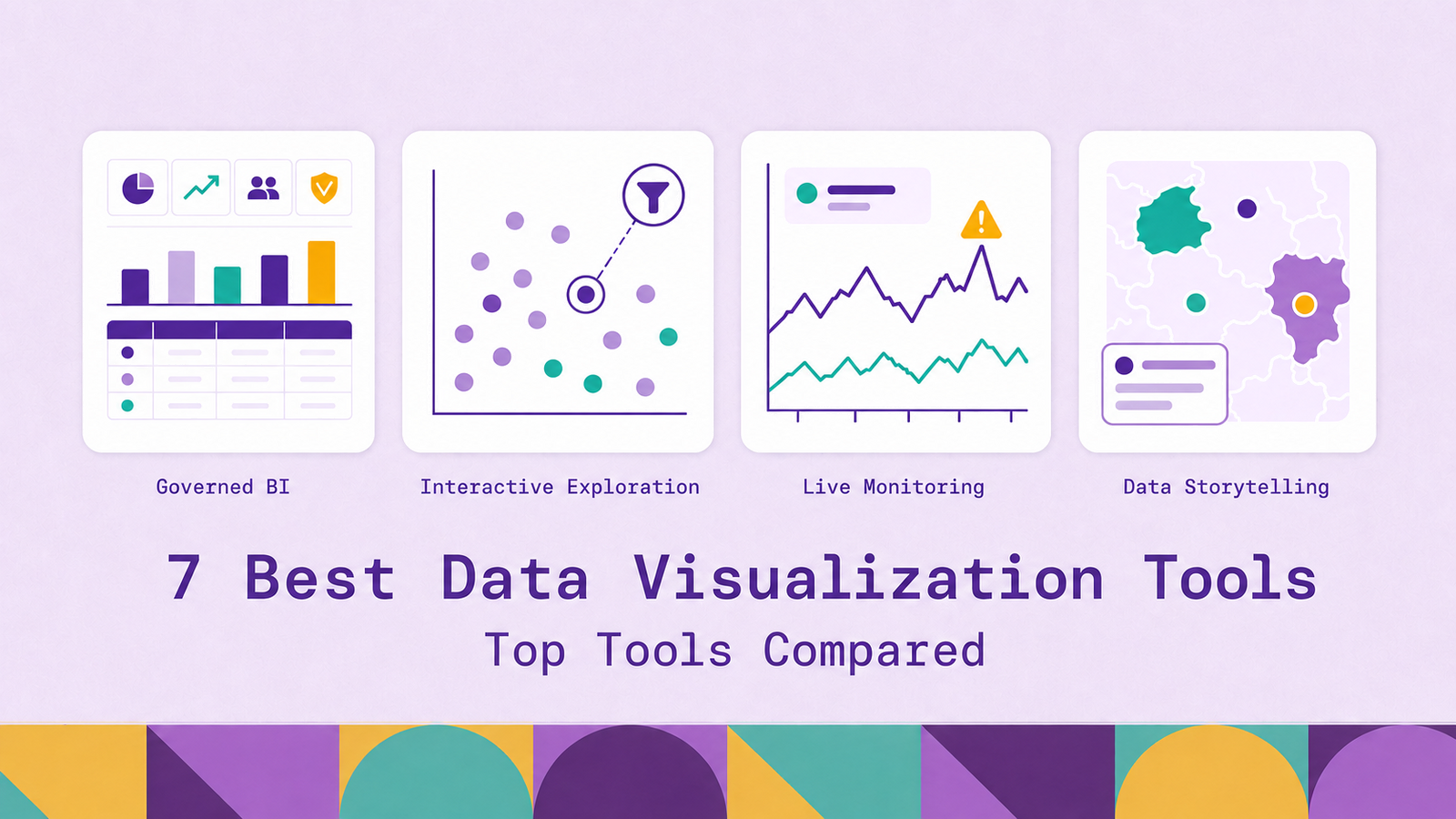
The best data visualization tool is the one that matches how a team asks questions. A finance group building governed monthly reports needs a different product from an operations team watching live service metrics or a newsroom publishing an interactive story. Treating all three as the same dashboarding problem leads to a polished interface that is awkward to maintain or, worse, easy to misread.
This guide explains how visualization tools turn source data into charts and dashboards, the capabilities that matter during evaluation, and seven strong options for different technical and business contexts. The comparison covers each tool's use cases, benefits, and limitations so that best means best fit rather than the longest feature list.
What are data visualization tools?
Data visualization tools turn values, categories, time series, and relationships into visual forms such as charts, maps, tables, and interactive dashboards. A useful visualization makes a pattern easier to detect, a comparison easier to judge, or a change easier to monitor than the underlying rows would.
The category spans several kinds of product. Business intelligence platforms combine visual authoring with data models, access controls, sharing, and scheduled refreshes. Other tools specialize in operational dashboards, self-hosted analytics, public data stories, or quick browser-based reports.
That range matters because a chart editor is only one part of a production visualization system. Teams also need to connect data, define metrics, decide whether queries run live or against cached results, control who can see what, and distribute the output. A tool can be excellent at visual exploration while offering little support for governed metric definitions. Another can be excellent at alerting on time series while making a board report unnecessarily difficult to build.
Data visualization also differs from data analysis. Analysis includes cleaning data, testing assumptions, calculating results, and interpreting them. Visualization is the interface through which part of that work is explored or communicated. An attractive dashboard is not proof that its source data or business definitions are sound.
How do data visualization tools work?
Most visualization systems follow the same broad path from source to screen, though they make different architectural choices at each stage.
Connect. The tool first connects to a spreadsheet, application, database, warehouse, lakehouse, or monitoring system. A connector translates the source's authentication, metadata, and query interface into something the visualization platform understands. Some tools can combine several sources in one model; others work best when the joins and transformations have already been completed upstream.
Model and prepare. The platform assigns types to fields, defines relationships, creates calculated measures, and may reshape data before it is displayed. This layer determines whether a label such as monthly active customer has one shared definition or a slightly different formula in every report. Data quality problems also surface here. Dates stored as strings, duplicated identifiers, and inconsistent category names can all produce misleading charts even when the rendering is technically correct.
Query. When a user opens a report or changes a filter, the tool retrieves the required result. A live or direct-query connection sends work to the source system at interaction time. An extract or import mode queries a cached copy that is refreshed on a schedule. Live access favors current data and centralized governance, while extracts can improve interactive response and reduce repeated load on the source. The right choice depends on freshness requirements, source performance, and the cost of maintaining another copy.
Encode and render. The tool maps fields to visual properties such as position, length, color, size, and shape. The author chooses the chart and configures axes, aggregation, sorting, labels, and formatting. Good defaults help, but they cannot determine whether a line chart, scatter plot, map, or network is the honest representation of a particular question.
Interact and distribute. Filters, drill-downs, cross-highlighting, tooltips, and alerts turn a static result into an exploratory interface. The view may be published, embedded, exported, or displayed on a shared screen. Permissions should travel with it so that sharing does not widen access to the underlying data.
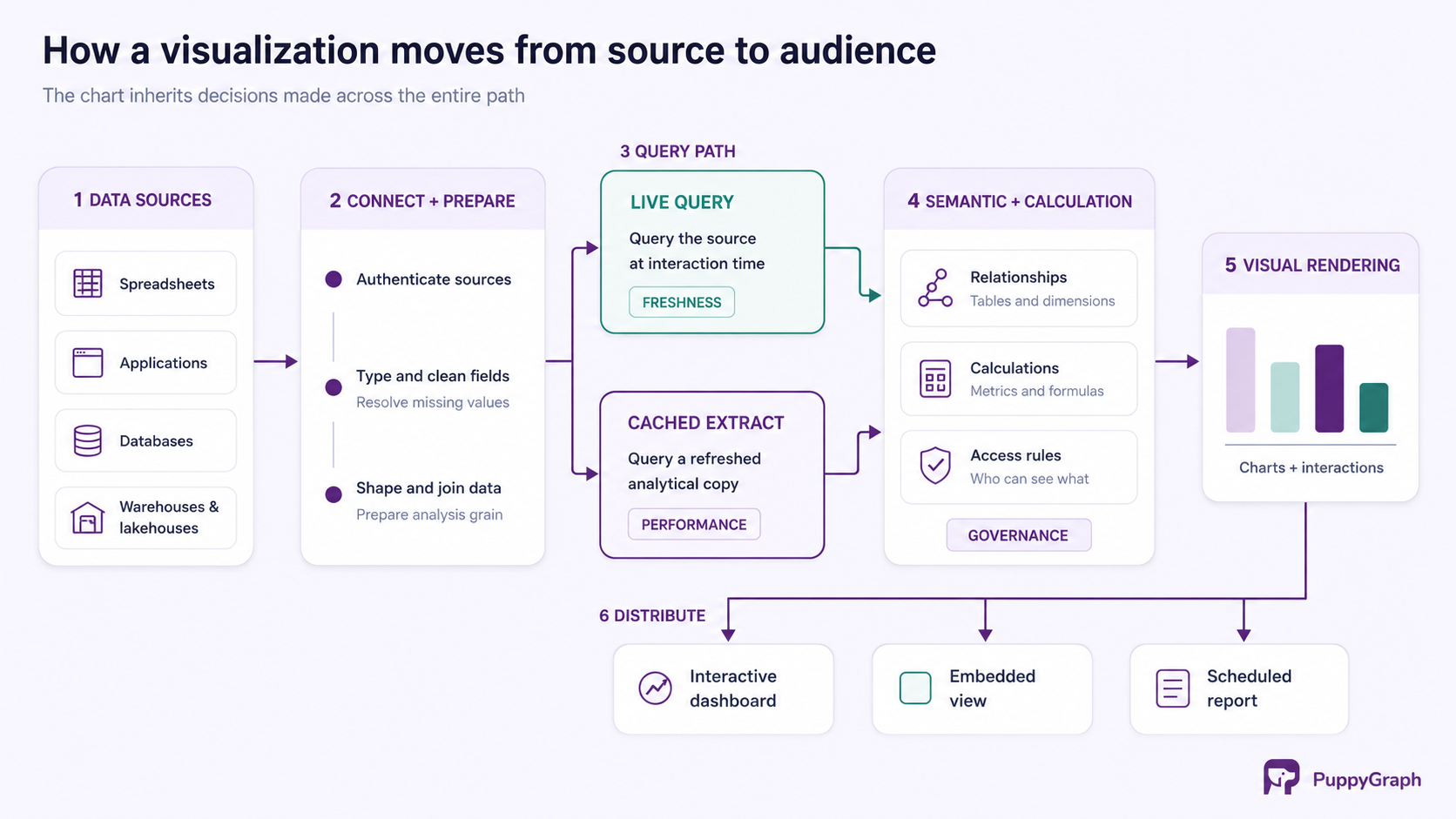
The visible chart is therefore the end of a chain. Connection design affects freshness, modeling affects meaning, query execution affects responsiveness, and distribution affects who can act on the result. Evaluating only the chart gallery misses most of the system that keeps a visualization useful after its first demo.
Key features of data visualization tools
Feature checklists are most useful when each item is tied to a real operating requirement. These are the capabilities that usually separate a successful deployment from an abandoned dashboard library.
Connectivity, freshness, and performance. Check the systems the tool connects to, how it authenticates, and whether each connector supports the required query mode. Evaluate refresh scheduling, incremental processing, caching, query limits, and failure notifications. Test dashboard load time with production-sized data, realistic concurrency, and the network path the deployed service will use.
Semantic modeling and governance. Reusable dimensions, measures, relationships, and business definitions keep reports consistent. As the number of authors grows, teams also need lineage, ownership, role-based permissions, row-level security, audit logs, and a change process. Governance should apply to the data and model, not only to the report file.
Visual range and exploration. Standard bars, lines, scatter plots, tables, and maps cover most analytical work. Specialized uses may require geospatial layers, statistical plots, network diagrams, or custom components. Cross-filtering, drill-through, parameters, tooltips, annotations, and saved views should help readers move from summaries to supporting records without hiding the active filter state.
Collaboration, distribution, and accessibility. Look for authoring, comments, version history, subscriptions, exports, embedding, and mobile behavior that fit the audience. Public publishing and governed internal sharing have different requirements. Keyboard navigation, focus order, screen-reader labels, color contrast, and alternatives to color-only encoding determine whether the result communicates reliably to its full audience.
Extensibility and operations. APIs, custom visuals, infrastructure-as-code support, and embedding controls matter when analytics becomes part of another product. For self-hosted software, include upgrades, backups, high availability, security patching, and usage monitoring in the evaluation. A free license does not mean a zero-cost service.
The weighting depends on the deployment. A public data story can prioritize visual control and accessible distribution, while an internal BI estate may put governed definitions and permissions first. An operational dashboard may treat query latency and alert delivery as the deciding criteria. Evaluate the complete operating model, not the editor alone.
7 best data visualization tools
The tools below are not ranked from universally strongest to weakest. Each represents a credible choice for a distinct combination of audience, data architecture, deployment model, and output.
Microsoft Power BI
Microsoft Power BI combines desktop report authoring, shared semantic models, dashboards, and distribution through the Power BI service and the wider Microsoft Fabric platform. Its visual editor supports self-service report creators, while DAX calculations and model relationships provide a deeper data-modeling layer.
The product supports Import, DirectQuery, and composite semantic-model modes. Import loads data into the model for interactive analysis. DirectQuery leaves data at the source and queries it as users interact. Composite models can mix storage modes, which helps teams apply different freshness and performance choices to different tables.
Best for. Power BI is a strong fit for organizations already using Microsoft 365, Azure, SQL Server, or Fabric. It handles recurring management reporting, governed metrics, and broad internal distribution particularly well.
Benefits and limitations. Its ecosystem integration and range from self-service reports to centrally managed semantic models make it versatile. That range also creates complexity. Teams need conventions for DAX, model ownership, workspaces, refreshes, and licenses. DirectQuery responsiveness still depends on the source and the generated queries.
Tableau
Tableau centers the authoring experience on visual exploration. An analyst places fields onto a view, changes the visual encoding, and follows patterns through filters, drill-downs, and linked dashboards. This makes it effective for exploratory work where the useful question emerges through interaction rather than from a fixed report specification.
Tableau supports live connections and extracts. Live connections query the source, while extracts create a snapshot that Tableau can optimize and refresh. Its relationship-based data model lets tables remain logically distinct until analysis time, which can preserve their level of detail better than flattening everything into one physical join.
Best for. Tableau supports flexible visual exploration and interactive dashboards, with a choice between fully hosted Tableau Cloud and self-hosted Tableau Server.
Benefits and limitations. The visual workflow supports rapid exploration and sophisticated dashboards without a custom web application. At scale, that freedom needs guardrails. Duplicated sources, workbook-specific calculations, and unconstrained publishing can produce several versions of the same metric. A governed deployment needs shared sources, ownership, and content management.
Data Studio (formerly Looker Studio)
Data Studio (formerly Looker Studio) is Google's browser-based reporting product. It connects reports to sources such as BigQuery, Google Sheets, Google Analytics, databases, and partner connectors, then provides charts, controls, calculated fields, themes, and shareable report links. It is separate from Looker, Google's enterprise BI platform with LookML modeling.
Each Data Studio data source provides the schema through which a report accesses a dataset. Authors can reuse a data source across reports or embed it within one report. This relatively lightweight model makes it quick to move from a familiar Google data source to a browser-based dashboard.
Best for. Data Studio works well for marketing reports, web analytics, small-team dashboards, and external reports where easy sharing matters more than a large centralized semantic layer.
Benefits and limitations. The low setup barrier and Google ecosystem connections suit teams that would otherwise circulate spreadsheets or slides. Its simplicity is also the boundary. Complex reusable logic, rigorous release workflows, and large governed analytics estates generally call for a fuller BI platform. Test connector refresh, quotas, and credential ownership directly.
Qlik Sense
Qlik Sense uses an associative data model designed for interactive exploration. When a user selects a value, the interface distinguishes selected, possible, alternative, and excluded values across the model. Qlik's associative selection model helps users see not only what matches a filter, but also which values fall outside it.
That behavior is useful when the path to an answer is not known in advance. A user can select a region, product, or customer segment and inspect how the available and excluded values change elsewhere, without starting from a fixed drill path. Qlik Sense is available through Qlik Cloud or a client-managed deployment.
Best for. Qlik Sense fits interactive analysis across several related datasets, especially when users need to explore possible associations rather than consume a fixed sequence of reports.
Benefits and limitations. The associative experience makes gaps and unexpected combinations visible. The trade-off is that data modeling and load design are central skills. Teams accustomed to conventional SQL models need time to learn how Qlik represents associations and propagates selections. Refresh and capacity design must reflect data volume and freshness requirements.
Grafana
Grafana is built for operational visibility. It queries a broad range of data sources, including metrics, logs, traces, SQL databases, and cloud services, and brings their results into time-series panels, logs views, tables, maps, and other dashboard components. These views can track application health, infrastructure, service-level objectives, and incident conditions.
Grafana also connects visualization to action. Its alerting system evaluates rules across supported data sources and routes notifications through configured contact points. Variables and dashboard links let operators move from a fleet-level view to a specific service or host while preserving context; data links and correlations can connect panels to related traces.
Best for. Grafana is a strong choice for engineering and operations teams building near-real-time views over observability and telemetry systems. Grafana OSS is self-managed and open source, while Grafana Cloud is managed by Grafana Labs.
Benefits and limitations. Its source breadth and time-series workflow provide a shared operational interface without forcing all telemetry into one backend. Grafana is not a general-purpose business semantic layer. It can display business charts, but metric governance, dimensional modeling, and formatted management reporting are not its center of gravity.
Apache Superset
Apache Superset is an open-source platform for exploring and visualizing data in SQL-speaking databases. It includes a no-code chart builder, SQL Lab for query authoring, dashboards, a lightweight semantic layer, and a security model with configurable roles. Superset queries connected systems rather than acting as a database or an ingestion engine.
The platform is designed for deployment on an organization's own infrastructure and can be extended through APIs and its plugin architecture. Its caching options can reduce repeated work. The deployment team must operate the Superset application and metadata database, and choose and operate a cache and workers when enabling features such as caching, asynchronous queries, alerts and reports, or thumbnails.
Best for. Superset fits data teams that want a self-hosted BI interface over existing warehouses and databases, have strong SQL skills, and are prepared to operate an application platform.
Benefits and limitations. The Apache license, SQL orientation, and extensibility avoid dependence on a proprietary BI runtime. The cost appears in operations. Upgrades, scaling, backups, authentication integration, and security fixes belong to the team running it unless a managed provider is used. Business users may need curated datasets before the interface feels self-service.
Flourish
Flourish is a template-based platform for interactive data visualization and storytelling. Its visualization catalog includes charts, maps, animated transitions, surveys, network views, and other presentation-oriented formats. Authors add data to a template, bind columns to visual properties, customize the design, and publish or embed the result.
Flourish stories can arrange visual states into a guided sequence, which is useful when the reader should encounter an argument in a deliberate order rather than explore an open-ended dashboard. This orientation distinguishes the product from BI tools that prioritize recurring internal monitoring.
Best for. Flourish fits communications teams, researchers, educators, and publishers creating interactive explainers, presentations, and public-facing visual stories through a no-code workflow.
Benefits and limitations. Templates shorten the path to interactive work that would otherwise require front-end development. The platform is not a substitute for a governed semantic layer or an operational alerting system. Data preparation, reusable metrics, and approval workflows may need to live elsewhere. Evaluate privacy and hosting requirements before uploading sensitive data.
Conclusion
Choosing a data visualization tool starts with the recurring decision it must support. Power BI and Tableau cover broad enterprise BI with different authoring strengths. Data Studio offers a quick route to shareable browser reports. Qlik Sense supports associative exploration. Grafana makes operational data visible and actionable. Apache Superset gives SQL-oriented teams an open-source, self-hosted option. Flourish turns analysis into a guided public story.
Evaluate finalists with one representative dataset and one real audience. Test data access, metric definitions, refresh behavior, interactive response, permissions, accessibility, and the work required to publish a change. The best-looking proof of concept is not necessarily the best production system. The durable choice is the one whose data model, operating burden, and distribution path fit the team that will maintain it.
Visualization also depends on the query layer beneath it. Tables and aggregates serve most dashboards well, while questions about paths, dependencies, shared entities, and multi-hop relationships need a graph-shaped model. PuppyGraph defines that model over data already held in SQL databases, warehouses, and lakehouses, including direct reads of open table formats such as Apache Iceberg and Delta Lake. By default, it queries those tables in place. Because PuppyGraph speaks openCypher over the Bolt protocol, existing Neo4j-compatible applications can consume its query results; results can also be exported to tabular storage or rendered in PuppyGraph's query and dashboard interfaces.
Try the forever-free PuppyGraph Developer Edition and book a demo with the team to see how openCypher and Gremlin queries traverse warehouse and lakehouse tables, with no graph-specific ETL, before relationship-shaped results reach the visualization layer.

Hao Wu is a Software Engineer with a strong foundation in computer science and algorithms. He earned his Bachelor’s degree in Computer Science from Fudan University and a Master’s degree from George Washington University, where he focused on graph databases.


