

Best Data Analysis Platforms in 2026: Top Tools Compared
The best data analysis platform depends on the questions your team needs to answer and the infrastructure it can maintain. A finance team distributing recurring reports, an analyst exploring customer behavior, and an engineer tracing dependencies across systems need different combinations of modeling, querying, and presentation. A platform can fit one of those jobs well while adding unnecessary work to another.
This guide compares nine options for 2026, from established business intelligence platforms to a specialized graph analysis layer. It explains what to evaluate, where each tool fits, and how to test a shortlist against your own data before committing to a wider rollout.
What is a data analysis platform?
A data analysis platform provides an environment for connecting to data, organizing it into usable models, asking questions, and sharing results. Depending on the product, it may also handle data preparation, access controls, scheduled reporting, and collaboration. Its purpose is to make an analytical workflow repeatable, so answering the next question does not require rebuilding the entire process.
Consider a revenue report. The platform needs access to orders and refunds, a definition of net revenue, a way to group results by period, and controls over who can view customer details. The chart is the visible output. The connections, calculations, and permissions determine whether that output remains useful when new data arrives or another department starts using it.
Products divide this work differently. Power BI combines modeling and reporting, while Looker uses LookML models to generate SQL against a connected database. Some platforms include ingestion and transformation; others depend more heavily on prepared warehouse tables. The product boundary affects which responsibilities stay with your data team.
This comparison focuses on shared analysis and business intelligence, with a specialized option for questions about connected entities. Statistical programming environments and machine learning platforms serve additional workflows, such as experimental modeling and model training. If those are your primary requirements, they deserve a separate evaluation.
The useful unit of comparison is therefore the complete workflow: how data reaches the analyst, how its meaning is defined, and how another person can reproduce the answer.
How to choose a data analysis platform
Evaluate the platform against the work people will actually perform. Five criteria expose the most consequential differences before a demonstration starts steering the decision.
Analysis workflow. Identify who creates models, who explores data, and who only consumes reports. A business user changing filters needs a different interface from an analyst maintaining reusable calculations. Include both recurring questions, such as revenue by region, and exploratory ones, such as which customer segments explain an unexpected decline. Test whether users can move from a summary to the records behind it without an engineering handoff.
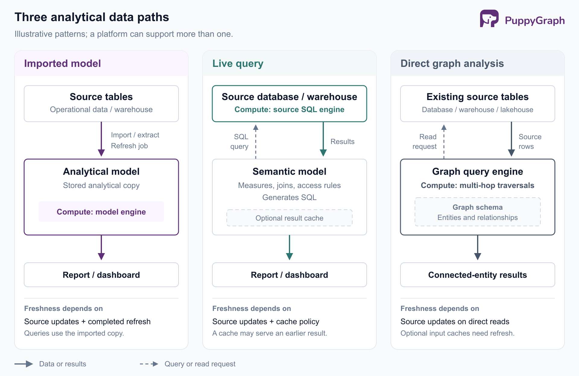
Data access and freshness. Check the exact connector and connection mode for each required source. Imported models introduce refresh work; queries against the source introduce dependencies on its responsiveness and availability. Microsoft's DirectQuery guidance illustrates why connection mode affects modeling choices and report performance. Caches add another freshness boundary. Specify an acceptable delay from a source update to a visible answer, then measure that entire interval.
Definitions and governance. Determine where shared measures, joins, and access rules live. A revenue calculation copied into separate reports can diverge when one author changes its refund logic. Ask who approves model changes, how downstream reports inherit them, and how access is enforced for viewers and exported results. A shared metric needs an accountable owner as well as a place to store its formula.
Operational fit. Establish who will operate the platform and its dependencies. Include connection credentials, refresh failures, model deployment, monitoring, upgrades, and recovery. For a hosted service, evaluate how it reaches private data. For a deployment you manage, include the people and infrastructure needed to keep it available. Test a renamed source column and an expired credential, since both reveal more about maintainability than a successful first connection.
Total cost. Model the intended deployment: authors, viewers, embedded consumers, source compute, storage, support, and administration. Feature packaging matters alongside price. For example, Power BI sharing capabilities depend on licensing and capacity. Request a quote for your actual audience and workload, including growth assumptions. A low entry price says little about the cost of distributing governed reports across an organization.
Apply these criteria to AI features too. During a trial, ask a natural-language question with an ambiguous measure or time period. Inspect the interpretation, calculation, filters, and permissions before judging the prose of the answer. The purchasing decision should rest on a workflow that users can explain and operators can support.
Best data analysis platforms in 2026
The selections below cover distinct approaches to shared analytics. Their recommended uses are editorial assessments based on documented capabilities, not a benchmark ranking. Power BI, Tableau, Looker, and Qlik provide useful starting points when the central requirement is a shared BI environment.
Power BI: reporting for Microsoft-oriented teams.
Power BI combines data preparation, semantic modeling, and report distribution. Microsoft's overview documents Power Query transformations, DAX calculations, and the relationship between Power BI Desktop, the Power BI service, and Microsoft Fabric. Teams already working with these technologies can evaluate how much existing knowledge and infrastructure they can reuse.
Its modeling layer is especially relevant when many reports need the same measures. Instead of rebuilding a revenue definition for every dashboard, the team can organize reporting around a shared semantic model. Microsoft's semantic model documentation explains how models can contain imported data, issue queries to sources, or combine those approaches.
The trade-off is the design and administration work behind the reports. DAX calculations, model relationships, storage modes, and refresh arrangements all need ownership. DirectQuery also makes source performance part of the report experience. In a pilot, build a shared measure, use it in multiple reports, and change its definition. Include distribution to ordinary viewers in the licensing review. Power BI belongs on the shortlist when governed reporting and the Microsoft ecosystem are central requirements.
Tableau: visual exploration.
Tableau deserves consideration when analysts work by changing views, comparing distributions, and following patterns through interactive visualizations. Its authoring documentation covers building charts and maps across Desktop and web workflows. The Analytics pane adds objects such as reference lines, box plots, and trend lines to a view.
That makes Tableau a useful candidate when the analytical task involves deciding which visual comparison explains a result. A merchandising analyst, for example, might need to compare regional sales distributions, isolate unusual stores, and present the findings in a dashboard that colleagues can explore. Test that sequence, including the effort required to build and maintain the views.
Tableau supports live connections and extracts. Live connections send queries to the database; extracts introduce a separate refresh process. Choose the mode deliberately and measure both responsiveness and freshness. Also establish where reusable calculations belong before workbooks multiply. Tableau's visual flexibility is most useful when the organization pairs it with consistent data definitions and a clear publishing process.
Looker: centrally maintained metrics.
Looker organizes analysis around LookML, which describes dimensions, measures, calculations, and relationships. Looker uses those definitions to generate SQL for the connected database. Analysts maintain the model, and business users explore the exposed fields through Looker's interface.
This separation suits organizations that want departments to reuse agreed definitions while asking different questions. A subscription business could model the rules for paid accounts and recurring revenue, then make those measures available for analysis by region, plan, or acquisition channel. LookML projects can be version-controlled in Git, giving model changes a development workflow that teams can review.
The corresponding commitment is ongoing modeling work. Someone must maintain joins, definitions, and the relationship between the model and changing warehouse tables. Include that work in the pilot instead of evaluating only finished dashboards. Test how quickly a new field reaches users and whether a changed measure produces the expected results across existing content.
This entry covers Looker, the BI platform built around LookML. Google's product comparison distinguishes it from Data Studio (formerly Looker Studio), its separate reporting product. Keep those product identities clear when comparing proposals, documentation, and required skills.
Qlik Sense: associative exploration.
Qlik Sense's associative selection model shows how selections affect related values in loaded data. Its selection states distinguish selected, possible, and excluded values. That gives analysts a way to examine both what matches a selection and what falls outside it.
For example, an operations analyst investigating a supplier could explore related products and locations, then inspect values excluded by the current selection. The useful evaluation question is whether that interaction helps users discover relevant comparisons without requiring a new report for every path they follow. Associations still depend on the data model you supply; they do not establish business meaning or causation on their own.
Be precise about the offering. Qlik distinguishes Qlik Sense's client-managed deployment from Qlik Cloud Analytics, its SaaS offering. Its deployment comparison also documents differences in administration and content organization. Evaluate the environment you intend to run, including application reloads and access management. Qlik is worth shortlisting when exploratory selection across related data is a central part of the analysts' daily work.
For teams that also need to assemble operational data, the next two options bring data preparation and reporting into the same product workflow.
Domo: integrated data preparation and business reporting.
Domo combines data integration with BI and application capabilities. Its Magic ETL tools let users build visual transformation flows, combine datasets, and schedule repeatable processing. This makes it relevant when the immediate challenge includes preparing data from several business systems before a report can be built.
An operations team could evaluate Domo by bringing together sales, fulfillment, and support records, defining a shared customer identifier, and producing a recurring service-performance view. The pilot should include failed loads and changes to source fields. Those cases expose whether the team can maintain the flow after the initial dashboard is delivered.
Domo also offers cloud integrations, allowing organizations to work with existing cloud data platforms. Establish which data is ingested, which remains in an external platform, and where transformations execute for your chosen configuration. That distinction affects freshness, source workload, and the scope of administration.
The purchasing question is whether the integrated workflow reduces the number of components your team must coordinate. If you already have established ingestion, transformation, and storage services, identify which Domo capabilities you would use and who would own any overlapping logic.
Zoho Analytics: application-focused reporting.
Zoho Analytics is worth evaluating when business teams need reports across application data, especially where Zoho products are already part of the workflow. Its Zoho CRM connector provides prebuilt reports and dashboards alongside the ability to create additional analyses. This gives a sales team a concrete starting point for pipeline and account reporting.
Use a real reconciliation problem in the trial: connect CRM deals to the records used to recognize revenue, then check which identifiers and dates make the comparison valid. Prebuilt content can help establish the first report, but it still needs to match your organization's definitions of a customer, a closed deal, and recognized revenue.
Zoho supports imported data and Live Connect for supported sources. The latter queries the source and can also use configured caching. Availability and modeling behavior depend on the selected mode and plan, so validate the actual source combination you need.
Shortlist Zoho Analytics when packaged application reporting is valuable and the required transformations fit the workflow you can maintain. Assess custom joins, refresh behavior, and sharing with the people who will use the reports beyond the originating team.
The remaining options address spreadsheet-oriented analysis, shared database querying, and relationship analysis. They can fill different roles within an existing data environment.
Sigma: spreadsheet-oriented warehouse analysis.
Sigma provides a spreadsheet-style interface over connected data platforms. Workbook operations generate SQL, allowing analysts to work with tables, formulas, and pivots while using warehouse compute. Its query history exposes generated queries and execution details for troubleshooting.
This is a useful fit to test with finance or operations users who are comfortable with spreadsheet analysis but need access to centrally managed data. Ask them to investigate a variance, change the grouping, and explain the calculation to a colleague. Measure whether they can complete the task without exporting an unmanaged working copy.
Sigma also supports input tables, which let users add structured data for planning and related workflows. Input data is written to designated schemas in the connected platform, so administrators must plan write access and ownership as well as read permissions.
The operating trade-off follows the architecture: warehouse design, workload, and cost remain part of the analytical experience. Inspect cache behavior and query history during the pilot. Sigma is a strong candidate when you want a familiar analytical interface and already have a data platform prepared to support interactive use.
Metabase: shared SQL and visual querying.
Metabase supports both a graphical query builder and a native query editor. Users can assemble filters, joins, and summaries visually, while analysts can write SQL directly. Saved questions provide a reusable basis for charts and dashboards.
That makes it a useful candidate for a team with prepared database tables that wants to share recurring analyses. A product team could expose curated account and activity data, let business users explore common questions visually, and retain SQL for analyses that need more control. Check whether the available drill-through behavior matches how users investigate an unexpected result.
Metabase offers self-hosted deployment and Metabase Cloud. The open-source edition provides an entry point, while the plan comparison distinguishes paid capabilities such as advanced permissions. Evaluate the edition that meets your access requirements before assuming the initial deployment cost represents the finished system.
For self-hosting, include upgrades, backups, monitoring, and incident ownership in the decision. Metabase belongs on the shortlist when database querying and shareable dashboards cover the main workflow, with an operating model your team can support.
PuppyGraph: a specialized option for relationship analysis.
Some questions require following connections: which accounts share devices, which suppliers sit upstream of an affected component, or which services depend indirectly on a failed system. PuppyGraph lets analysts express those questions through entities and relationships mapped over existing data. The graph schema functions as an ontology: a defined model of the entities, relationships, and properties that the analysis uses.
PuppyGraph connects to supported SQL databases, warehouses, and lakehouses, including direct reads of open table formats such as Iceberg and Delta Lake. The default direct-query path requires no graph-specific ingestion or persistent duplicate dataset. Analysts query the model with openCypher or Gremlin, while the underlying tables remain in their existing storage systems.
PuppyGraph compiles graph queries into plans of node and edge operators that execute in its own distributed engine. Because the query is represented as graph operators end to end, the engine can optimize specifically for multi-hop traversals. This supports analysis in the vocabulary of connections across the modeled data.
Evaluate it alongside your BI platform when relationship questions justify a dedicated analytical layer. The team still needs to define entity identifiers and relationship mappings. A useful pilot starts with one concrete traversal and validates the returned paths against known records. Its role is to complement recurring business reporting with connected-entity analysis.
Data analysis platforms comparison table
Use this table to narrow the shortlist. The workflow and trade-off columns summarize the documented capabilities above; the final column suggests what to validate in your own environment.
The distinction that matters is how each approach distributes work between analysts, model owners, and infrastructure teams. An imported model creates refresh responsibilities; querying a warehouse makes its workload part of the user experience. A specialized graph layer adds another model to maintain, justified when connected-entity questions are recurring and valuable.
How to choose the right data analysis platform
Turn the comparison into a purchasing decision by building a small shortlist and giving every candidate the same acceptance criteria.
Start from the existing environment. A team already maintaining Power Query and DAX models should include Power BI. Analysts whose work centers on visual exploration should test Tableau or Qlik. A warehouse team prioritizing shared definitions should evaluate Looker, while spreadsheet-oriented users can test Sigma. Domo and Zoho Analytics deserve consideration where application integration is part of the requirement; Metabase fits a shortlist centered on shared database analysis. Add a graph layer only when relationship queries are part of the actual workload.
Choose representative tasks. Use a recurring report, an exploratory investigation, and a permissions-sensitive view. For each, specify the expected result, who can access it, acceptable freshness, and the work needed to maintain it. Include a calculation that is easy to get subtly wrong, such as net revenue after partial refunds. A correct result on realistic data is more informative than the number of available chart types.
Test changes and failures. Rename a source field, add a new business category, and change a shared measure. Record how many models and reports require edits. Run the evaluation with ordinary user accounts, then inspect exports and scheduled deliveries. For source-query workflows, measure warehouse activity while several users interact with reports. For imported data, measure the time from source change through refresh to the visible result.
Price the working configuration. Ask for a proposal based on the edition, permissions, connectors, and audience demonstrated in the pilot. Include data preparation work and ongoing ownership in the comparison. Document how to export essential definitions and results if the organization later changes platforms. Finish with named owners for models, access rules, and operational support.
Choose the platform whose verified workflow fits both the users and the team maintaining it. A successful pilot should leave you with a reproducible answer and a credible plan for operating the system after the evaluation ends.
Conclusion
The best data analysis platforms support different kinds of work. Start with the analytical questions, the location and quality of the data, and the people responsible for maintaining shared definitions. Then validate the complete path from source records to a result users can reproduce. That process produces a more useful decision than selecting a universal winner from a feature list.
Try the forever-free PuppyGraph Developer Edition and book a demo with the team to see how openCypher and Gremlin queries trace relationships across warehouse and lakehouse tables, with no graph-specific ETL, for the connected-data questions in your analytics evaluation.

Hao Wu is a Software Engineer with a strong foundation in computer science and algorithms. He earned his Bachelor’s degree in Computer Science from Fudan University and a Master’s degree from George Washington University, where he focused on graph databases.


